As a rule of thumb, hyperlinks should be immediately identifiable as such by the reader. And they should appear ‘clickable’.
According to research studies in link readability, web users still consider blue color in combination with underlined text as the typical hyperlink – just like it was at the beginning of the Internet.
That makes blue links still a good choice to stick with. More recent studies, however, found that underlined text can decrease readability and negatively affect user experience.
As Google changed their ranking algorithm over time, longer link text is now a ranking factor for Search Engine Optimization (SEO). Link text should be descriptive and make it immediately obvious to both users and search engines what the linked page is about.
In the end, the choice of color and font style of hyperlinks on your website is totally up to you! These are just some things to pay attention to when choosing a link color that fits both the design of your theme as well as readability/SEO requirements. ☺
Related: → Best Hyperlink Colors For Your Artist Website – With Hyperlink Style Guide
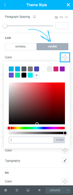
With that said, let’s dive straight into the topic of this blog post on how to change the hyperlink color of your WordPress theme in Elementor!


Thanks for sharing excellent informations. Your site is so cool. I am impressed by the details that you?¦ve on this web site. It reveals how nicely you understand this subject. Bookmarked this website page, will come back for extra articles. You, my friend, ROCK! I found just the info I already searched everywhere and just couldn’t come across. What a perfect website.
Hi Searson, thanks for leaving a comment. Great to hear that you find the content helpful! Looking forward to staying in touch with you (:
I adore meeting useful info, this post has got me even more info!
Great to hear that the post was helpful! (: